Google has begun updating its core apps with a flat Material Design makeover. This time its the turn of the Google Play Store which has been updated to version 5.0.31. The new design emphasizes the changes to user interface and experiences coming with Android L later this fall.
Straight up you will be able to see that the Play Store icon has become flatter and the app homepage now houses colorful icons for different categories of content available on the Play Store.

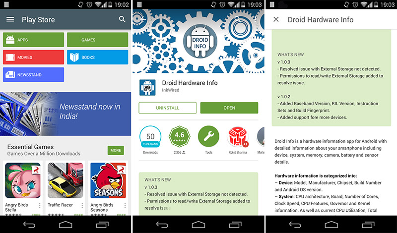
Not just that the color of the tiles in the homepage resonate to the overall theme inside those categories as well. You can see that below. This gives a unified and color co-ordinated look to the Play Store, making it somewhat easier to use. With the colors you always know where you are even without having to read the tab name.
The What's New section in apps now has the top bunk, so you can straightaway know what changes come with the new update of an app. Handy feature here. You will also notice some new animations when interacting with the Play Store app, but we will leave them for you to discover. The update has already begun rolling out and will be automatically installed on your device in the coming days.
Do you like the new Play Store makeover? Got anything to add? Sound-off in the comments section.